iOS 17 is set to release soon. Let's take a look at TipKit and how to customize its appearance.
Basic Setup
To start using TipKit, we need to set up the basics. Firstly, we have to configure the tips framework. Although there are several options for the 'configure' method, they are not relevant to this particular post. However, I highly recommend checking out the documentation for more information here.
To ensure effective testing of our code, the data used in this example is always reset at the start of the application. This could also be necessary for production if a user logs out of your application, allowing for the tips to be shown again on the next login.
import SwiftUI
import TipKit
@main
struct TipKitTestApp: App {
init() {
// Configure and load all tips in the app.
// For testing we always reset them
try? Tips.resetDatastore()
try? Tips.configure()
}
var body: some Scene {
WindowGroup {
ContentView()
}
}
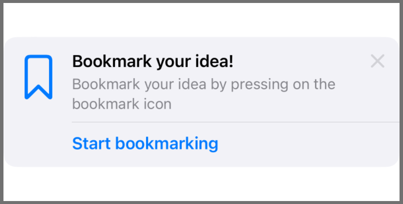
}Every tip is represented as an instance of the Tip type. This type encapsulates the different information about your tip like title, a longer message, an image and actions, where only the title is mandatory.
struct BookmarkTip: Tip {
    var title: Text {
        Text("Bookmark your idea!")
    }

    var message: Text? {
        Text("Bookmark your idea by pressing on the bookmark icon")
    }

    var image: Image? {
        Image(systemName: "bookmark")
    }

    var actions: [Action] {
        [
            .init(
                id: "1",
                perform: { print("Bookmark") },
                {
                    Text("Start bookmarking")
                }
            )
        ]
    }
}
Finally, we can add the BookmarkTip instance to your content view by referencing the TipView.
struct ContentView: View {
    // Create an instance of your tip.
    var tip = BookmarkTip()

    var body: some View {
        // Show the TipView
        TipView(tip)
    }
}
The default appearance now looks quite good, but many apps have their custom design system and might need to modify how tips are represented. In the next step, we will now customise the default appearance to look a little bit more custom.
Customization
Customising a TipView follows the same approach as customising Buttons. By implementing a TipViewStyle and applying it to the TipView.
First, we create a new struct conforming to TipViewStyle.
struct MyCustomTipViewStyle: TipViewStyle {
     func makeBody(configuration: Configuration) -> some View {
        // TODO
    }
}
Having this in place, let's implement the makeBody method. The configuration contains all the information we have declared in our BookmarkTip type which we can use to build our view. (Documentation)
It is possible to design entirely personalized view arrangements here. The only thing that may be slightly tricky is incorporating a close button. However, you can achieve a "close" functionality by utilizing configuration.tip.invalidate, which will produce the same result as the standard close button in the default view.
struct MyTipViewStyle: TipViewStyle {
    func makeBody(configuration: Configuration) -> some View {
        VStack(alignment: .leading, spacing: 16) {
            HStack {
                HStack {
                    configuration.image
                    configuration.title
                }
                .font(.title2)
                .fontWeight(.bold)

                Spacer()
                Button(action: {
                    configuration.tip.invalidate(reason: .tipClosed)
                }, label: {
                    Image(systemName: "xmark")
                })
            }

            configuration.message?
                .font(.body)
                .fontWeight(.regular)
                .foregroundStyle(.secondary)

            Button(action: configuration.actions.first!.handler, label: {
                configuration.actions.first!.label()
            })
            .buttonStyle(.bordered)
            .foregroundColor(.pink)
        }
        .padding()
    }
The last step is to add the tipViewStyle modifier to the TipView instance to apply the custom appearance.
struct ContentView: View {
    // Create an instance of your tip.
    var tip = BookmarkTip()

    var body: some View {
        // Show the TipView
        TipView(tip)
            .tipViewStyle(MyTipViewStyle())
    }
}
This will give us the nice custom appearance we just implemented.
UIKit customization
The same technique also works when you use TipKit in UIKit, which allows us to have the same appearance across the different UI frameworks.
// The tip
let tip = BookmarkTip()

// Regular UIView
let view = TipUIView(tip)
view.viewStyle = MyTipViewStyle()

// UICollectionView
let cell = TipUICollectionViewCell()
cell.configureTip(tip)
cell.viewStyle = MyTipViewStyle()

// Popover Controller
let popoverController = TipUIPopoverViewController(tip, sourceItem: view)
popoverController.viewStyle = MyTipViewStyle()
Conclusion
I hope I was able to explain a little bit about how tips appearance can be customised and adapted to your needs. This enables us to leverage the functionality of TipKit within a custom design system without relying on the default appearance.
Please feel free to reach out to me if you find any mistakes, have questions or suggestions. 🙂
See you next time! 👋