Whenever I build a custom reusable SwiftUI view as part of a larger application's design system, I follow the same principle: design its API to be as close as possible to Apple's view APIs. This keeps the "distance" between the behaviour of custom views and native view primitives small, and developers do not need to learn new ways of interacting with custom views.
This post explains the ideas that go into this thought process and how they can be implemented to create native-feeling custom views. It describes my personal process for creating and designing APIs for custom views. Please feel inspired by it, but do not view it as a silver bullet, since everyone has their own style of writing code.
Thoughts on Component Types
Before I start implementing a view component, I ask myself what kind of component I am going to build. I divide components into two categories: semantic components and prescriptive components. Semantic components describe a concept. A button, for example, is a component that can be pressed to execute an action. It does not come with a predefined UI; it can look like nearly anything. The same goes for a toggle. It simply describes the concept of "enabling something", while its visual representation is completely open. A BarChart component, on the other hand, is prescriptive: it already creates certain expectations about its visual appearance. Of course, it can be customised, but the fact that multiple bars will be displayed when it is rendered is undeniable.
Based on this classification, my approach to implementing and designing the APIs for these components can differ. Most of the time, I refrain from allowing custom styles for components whose visuals are fairly straightforward. However, I nearly always offer custom styles for components that merely describe a semantic concept.
More Than API Shape
Classifying a component is only the starting point. A native-feeling view is not defined by its call site alone; its semantics, data flow, interaction behaviour, and integration with its surroundings matter just as much. I try to consider these principles before moving on to the concrete API shape.
Model the Semantics First
Before thinking about the appearance of a component, I try to define what it represents and which states it supports. For the Rating component later in this post, this means answering questions such as: Can there be no rating? Are fractional values supported? Does the range always start at one? Can the component be read-only?
Answering these questions early helps make invalid states difficult to represent. If multiple values always belong together or have to fulfil certain invariants, introducing a dedicated model type can be better than accepting several unrelated parameters. It also makes intentional limitations explicit. A narrow API that clearly supports whole-number ratings from one to five is often better than a seemingly flexible API whose behaviour is undefined for other values.
The names should communicate these semantics using the vocabulary developers already know from system components. Argument labels such as selection, value, label, content, and isPresented are easier to understand when their meaning matches Apple's usage.
Follow SwiftUI's Data Flow
I use immutable values for input, a Binding when the component modifies state owned by its consumer, and internal State only for state owned by the component itself. A binding should communicate that data can flow back to the caller, not merely serve as a convenient way to pass a value.
It is also helpful to separate semantic state from transient visual state. A selected rating belongs to the component's public API, while details such as whether a star is currently pressed, hovered, or animating can usually remain internal or be passed to a style through its configuration.
Where possible, I favour composition over a growing collection of configuration flags. Parameters such as showsIcon, isCompact, and usesBorder quickly create unclear combinations. Dedicated initialisers, child-view slots, modifiers, and styles tend to scale more naturally. This leads to progressive disclosure: the common call site remains short, while specialised use cases are still available when needed.
Preserve Native Behaviour
When an interaction matches an existing SwiftUI control, I prefer that control over a raw gesture. A Button is usually a better foundation than onTapGesture for an element that performs an action because it already participates in keyboard interaction, focus handling, disabled-state behaviour, and accessibility.
Accessibility is part of the component's API rather than an addition to its final appearance. A reusable control should expose an appropriate label, value, role, and set of actions without requiring consumers to reconstruct its meaning from the rendered children. A rating control, for example, can provide an adjustable action so people using assistive technologies can change its value directly.
A custom component should also respect the environment around it. Depending on its purpose, this can include isEnabled, controlSize, dynamicTypeSize, layoutDirection, tint, accessibilityReduceMotion, and accessibilityDifferentiateWithoutColor. Supporting every environment value is not the goal; responding to the ones that affect the component's semantics and presentation is.
Keep the Component Predictable
Defaults, environment values, modifiers, and custom styles can all influence a component. Defining which one takes precedence makes the result predictable. I generally expect an explicit modifier at the call site to override an environment default, while a style remains responsible for its own visual details.
I also try to preserve view identity by avoiding unnecessary type erasure and large structural changes. Stable identity helps SwiftUI retain state and produce the expected animations and transitions. Type erasure can still be the right tool, as it is in parts of the style implementation below, but it should solve a specific problem rather than be the default.
Finally, a reusable view should be easy to preview and test in isolation. I like to cover its meaningful states as well as different colour schemes, Dynamic Type sizes, layout directions, localisations, and relevant environment values. This often reveals assumptions in an API before the component is widely adopted.
For public components, these decisions also affect source compatibility. Initialisers, generic constraints, default arguments, and overloads become harder to change once other modules depend on them. Documenting invariants and choosing extension points deliberately is therefore part of the design process, not something to postpone until the component is finished.
API Design
Once the semantics, valid states, and expected behaviour of a component are clear, API design turns those decisions into something developers can use. The call site should communicate the component's purpose without exposing details that belong to its implementation.
AI agents can help us implement and adopt components very quickly, which makes it even more important to consider the API first. An unsuitable design can otherwise spread across a codebase just as quickly. We have to ask which parameters the component actually needs: Is it a container that accepts other Views, or is it a leaf component that cannot host subviews and only accepts non-View values that define its appearance?
In the following sections, I want to share how I design what are, in my opinion, the most important parts of a custom view:
- The initialisers
- The customisation hooks
As a rule of thumb, I use a custom view style when a semantic component should support fundamentally different visual representations. I use environment values when a component keeps its identity and structure, but consumers should be able to adjust individual aspects of its appearance. We will look at both approaches in more detail below.
Initialisers
Initialisers are a developer's first point of contact with custom views. They should be easy to understand and immediately make it obvious what the component needs.
Container Views
Container views accept other SwiftUI views as their children. Therefore, we have to communicate this clearly. I am a fan of starting with the most flexible initialiser for a container view, accepting essentially any other View type. For example, let us imagine we want to develop a Card component that offers a header and a body slot. The corresponding minimal component could look like this:
public struct Card<Header: View, Content: View>: View {

    let header: Header
    let content: Content

    public init(
        @ViewBuilder header: () -> Header = { EmptyView() },
        @ViewBuilder content: () -> Content
    ) {
        self.header = header()
        self.content = content()
    }

    public var body: some View {
        VStack(alignment: .leading) {
            header
            content
        }
    }
}
// Call site
Card {
    Text("Header")
} content: {
    Text("Content")
}
With this initialiser, we enable a huge variety of possibilities. The intention is clear: the consumer has two slots they can fill, a header and a content (body) part. This is composition in practice: the component defines the structure while callers provide the views. The header is optional, since it produces an EmptyView by default.
This generic starting point also gives us a good opportunity to apply progressive disclosure. We can provide convenience initialisers for common cases without making the base API more restrictive. For example, imagine that a card very often needs a header with an image. We can offer a dedicated initialiser where the consumer only provides an Image, and the component makes sure that the image is placed correctly.
extension Card where Header == Image {
    public init(
        image: Image,
        @ViewBuilder content: () -> Content
    ) {
        self.header = image
        self.content = content()
    }
}

// Call site
Card(image: Image(.myAsset)) {
    Text("Content")
}
This also works if you need more specialised subcomponents. Imagine we want a reusable card that always has an icon and text in its header. We can come up with the following:
extension Card where Header == ProminentCardHeader {
    public init(
        image: Image,
        title: LocalizedStringResource,
        @ViewBuilder content: () -> Content
    ) {
        self.header = ProminentCardHeader(image: image, text: title)
        self.content = content()
    }
}

public struct ProminentCardHeader: View {
    let image: Image
    let text: LocalizedStringResource

    public var body: some View {
        HStack(alignment: .center) {
            image
                .resizable()
                .aspectRatio(contentMode: .fit)
                .frame(width: 40, height: 40)
            Text(text)
        }
    }
}

// Call site
Card(image: Image(.myAsset), title: "Hello, World") {
    Text("Content")
}
The initialiser remains very focused. By utilising a helper view, ProminentCardHeader, which takes care of correctly visualising our header, we made it very easy to add another initialiser to our container view with a predefined visual appearance. It is also noteworthy that I used LocalizedStringResource for the title parameter instead of a plain string. This has the advantage of being in line with Apple's components, and it benefits from the automatic key and translation handling provided by String Catalogs, introduced in Xcode 15.
A good reference for this pattern is ContentUnavailableView, which is part of the standard SwiftUI views.
Non-Container Views
For non-container views, the initialisers are a little easier to declare. My guidance here is to keep initialisers as short as possible and try to stick to the standards of the codebase and Apple's own views.
Imagine we have a Tag component with a title and an optional image. Its initialisers can follow the vocabulary developers already know from components such as Label: the title comes first, while an image or system image can be added when needed.
public struct Tag: View {
    private let title: LocalizedStringResource
    private let image: Image?

    public init(_ title: LocalizedStringResource) {
        self.title = title
        self.image = nil
    }

    public init(
        _ title: LocalizedStringResource,
        systemImage: String
    ) {
        self.title = title
        self.image = Image(systemName: systemImage)
    }

    public init(
        _ title: LocalizedStringResource,
        image resource: ImageResource
    ) {
        self.title = title
        self.image = Image(resource)
    }

    public var body: some View {
        HStack(spacing: 4) {
            if let image {
                image
            }
            Text(title)
        }
    }
}
These initialisers keep the common text-only call site short while offering familiar ways to add an image. LocalizedStringResource makes the title localisable, systemImage follows the argument label used by SwiftUI components, and ImageResource provides type-safe access to image assets.
I try to follow the same concept for other kinds of non-container views. The rule is to always try to align with system components:
- Offer multiple ways to initialise the view if possible
- When working with user-visible strings, try to use
LocalizedStringResourceinstead ofString - Make use of
ImageResourceto benefit from type-safe resource accessors - Whenever the view modifies data that is passed into it, use a
Binding
Customisation
Depending on the kind of view you are building, there are different ways to customise it. I want to focus on the two approaches I use most often: customisation via custom view styles, following the idea of familiar system styles such as ButtonStyle and LabelStyle, and customisation via the environment, like .foregroundStyle and .font.
Customisation via View Styles
Creating custom view styles can be a little involved and is not as straightforward as you might think. In return for that effort, we give consumers of our components a very flexible way to define their own styles for semantic components. In my opinion, this kind of customisation makes the most sense for components that convey a certain kind of functionality or semantic meaning rather than already having a fixed visualisation in mind.
To better visualise the process, let us create a custom view style for a Rating component that encapsulates the concept of rating something based on a selected value and a maximum value. It does not know anything about its visuals. In addition to the rating itself, it also offers the possibility to describe the rating with a label. This will demonstrate the most common capabilities of custom view styles:
- Handle child views passed by consumers
- Handle non-
Viewvalues passed by consumers
Before implementing it, let us make its invariants explicit. The value should remain inside the supplied range. We use Double so styles such as a numeric representation can display fractional values, while the default star style deliberately offers whole-number choices. Component-driven changes, including accessibility actions, are clamped to the range.
We start by defining RatingStyleConfiguration, which is the configuration consumers will use when implementing custom view styles. This is similar to ButtonStyleConfiguration when implementing a custom ButtonStyle.
public struct RatingStyleConfiguration {
    public let value: Binding<Double>
    public let range: ClosedRange<Double>
    public let label: Label

    // A type-erased label of the Rating control
    public struct Label: View {
        let underlyingLabel: AnyView

        init(_ label: some View) {
            self.underlyingLabel = AnyView(label)
        }

        public var body: some View {
            underlyingLabel
        }
    }
}
Next, we define the actual protocol for RatingStyle.
public protocol RatingStyle: DynamicProperty {
    associatedtype Body: View

    @ViewBuilder func makeBody(configuration: Configuration) -> Body

    typealias Configuration = RatingStyleConfiguration
}
One key aspect when working with custom view styles is that consumers expect to access @Environment properties in their style definitions, because they are used to doing so when working with Apple's style protocols. For this to work, our style conforms to DynamicProperty, and we create an intermediate layer that resolves the current environment before the actual custom style is invoked.
// This is the key piece. Because `Style` conforms to `DynamicProperty`,
// SwiftUI updates the style's dynamic properties before invoking `body`,
// which populates any @Environment, @State, etc. declared inside the
// concrete style.
struct ResolvedRatingStyle<Style: RatingStyle>: View {
    var style: Style
    var configuration: RatingStyleConfiguration

    var body: some View {
        style.makeBody(configuration: configuration)
    }
}
extension RatingStyle {
func resolve(configuration: Configuration) -> some View {
ResolvedRatingStyle(configuration: configuration, style: self)
}
}There are two deliberate type-erasure boundaries in this implementation. RatingStyleConfiguration.Label stores an AnyView so every style receives the same non-generic configuration type, regardless of the concrete label supplied to Rating. Later, Rating uses another AnyView because the existential style stored in the environment does not expose one concrete Body type. The outer Rating view still has stable identity, but this erasure gives up concrete type information inside those boundaries. I therefore keep it local to the places where the style architecture requires it.
To follow our guideline of integrating custom views as seamlessly as possible into Apple's SwiftUI ecosystem, we register the rating style in EnvironmentValues:
extension EnvironmentValues {
    @Entry var ratingStyle: any RatingStyle = .star
}
To make life easier for our fellow developers, we create a small extension on View that lets them inject the rating style into the view hierarchy's environment.
extension View {
    public func ratingStyle(_ style: some RatingStyle) -> some View {
        environment(\.ratingStyle, style)
    }
}
We declare a default here, following SwiftUI's approach to types such as button styles. A component that depends on a style needs a default to render anything at all. We will define the .star style later; first, let us finish the base component definition.
public struct Rating<RatingLabel: View>: View {
    @Environment(\.ratingStyle) private var style

    @Binding private var value: Double

    private var label: RatingLabel
    private let range: ClosedRange<Double>

    public init(
        value: Binding<Double>,
        in range: ClosedRange<Double> = 1...5,
        @ViewBuilder label: () -> RatingLabel
    ) {
        _value = value
        self.range = range
        self.label = label()
    }

    public var body: some View {
        let configuration = RatingStyleConfiguration(
            label: RatingStyleConfiguration.Label(label),
            value: $value,
            range: range
        )
        AnyView(style.resolve(configuration: configuration))
            .accessibilityElement(children: .combine)
            .accessibilityValue(Text(value, format: .number))
            .accessibilityAdjustableAction { direction in
                switch direction {
                case .increment:
                    value = min(value + 1, range.upperBound)
                case .decrement:
                    value = max(value - 1, range.lowerBound)
                @unknown default:
                    break
                }
            }
    }
}
It is important to create the configuration in body so that style resolution can take part in SwiftUI's regular view resolution flow and receive information about state and environment changes. The accessibility behaviour also lives on Rating rather than inside an individual style. This preserves the control's meaning when its visuals change. For this example, an accessibility adjustment moves the value by one point; a production component could expose a configurable step if its domain requires a different increment.
We can also apply one of the lessons from the first section of this post. Consumers will most often use text as the label, so let us enhance the rating control's initialiser to make it easier to instantiate:
extension Rating where RatingLabel == Text {
    public init(
        title: LocalizedStringResource,
        value: Binding<Double>,
        in range: ClosedRange<Double> = 1...5
    ) {
        self.init(value: value, in: range) {
            Text(title)
        }
    }
}
With the foundations in place, we can implement the default .star style. The intermediate resolver view enables us to access the SwiftUI environment just as we do with system styles. This particular .star style interprets the range as a set of whole-number choices, while another style could visualise the same Double values differently.
public struct StarRatingStyle: RatingStyle {
    @Environment(\.colorScheme) private var colorScheme

    public init() {}

    public func makeBody(configuration: Configuration) -> some View {
        HStack {
            configuration.label
            HStack(spacing: 4) {
                ForEach(
                    Int(configuration.range.lowerBound)...Int(configuration.range.upperBound),
                    id: \.self
                ) { rating in
                    Button {
                        configuration.value.wrappedValue = Double(rating)
                    } label: {
                        Image(systemName: Double(rating) <= configuration.value.wrappedValue ? "star.fill" : "star")
                            .foregroundStyle(colorScheme == .dark ? Color.yellow : Color.orange)
                    }
                    .buttonStyle(.plain)
                }
            }
            .accessibilityHidden(true)
        }
    }
}

extension RatingStyle where Self == StarRatingStyle {
    public static var star: Self {
        Self()
    }
}
With that, we have finished creating a custom view style factory. Consumers can now easily create new styles with the same ergonomics they are used to from system styles. For example, they can implement a numeric style:
public struct NumericRatingStyle: RatingStyle {
    @Environment(\.isEnabled) private var isEnabled

    public init() {}

    public func makeBody(configuration: Configuration) -> some View {
        HStack {
            configuration.label
            HStack(spacing: 2) {
                Text(configuration.value.wrappedValue, format: .number.precision(.fractionLength(1)))
                    .fontWeight(.semibold)
                Text("/ \(Int(configuration.range.upperBound))")
                    .foregroundStyle(.secondary)
            }
            .opacity(isEnabled ? 1 : 0.5)
        }
    }
}

extension RatingStyle where Self == NumericRatingStyle {
    public static var numeric: Self {
        Self()
    }
}
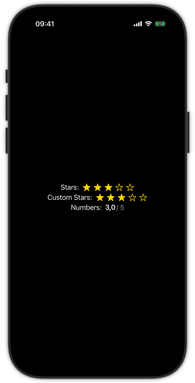
These styles also demonstrate how the component participates in its surroundings. NumericRatingStyle reads isEnabled from the environment, while the buttons in StarRatingStyle automatically adopt SwiftUI's disabled interaction behaviour. The star style additionally responds to colorScheme. Each style only reads the values that matter to its presentation and behaviour.
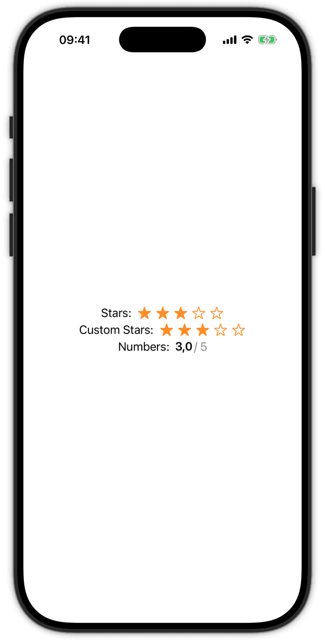
Lastly, let us test it and see that the component can be used like any other stylable system component.
@State var rating: Double = 3

Rating(title: "Stars:", value: $rating)

Rating(value: $rating) {
    Text("Custom Stars:")
}

Rating(value: $rating) {
    Text("Numbers:")
}
.ratingStyle(.numeric)
Running the example shows that the custom styles are applied and that the star rating style's access to the colour scheme environment value works as expected.
Customisation via Environment
Customisations via the environment are much more straightforward than creating custom view styles. However, they are also more restricted. Therefore, I mostly use them when building a prescriptive component, meaning there is already a predefined set of visualisations the view can have.
Let us pick up the Tag component from earlier. Its capsule shape and compact layout are part of its identity, but consumers should be able to adapt the background to different contexts. For this, we define a custom environment entry.
extension EnvironmentValues {
    @Entry var tagBackgroundStyle: (any ShapeStyle)? = nil
}
For this parameter, we choose the broad ShapeStyle abstraction instead of a concrete visual type. Many system components use it to define a background's appearance, and it can represent a Color, a gradient, a material, or any other type that conforms to the protocol. The default is nil in our example, but it can of course be adapted to any individual case.
To follow Apple's way of setting environment values, let us create a small extension on View that makes the value convenient to set:
extension View {
    public func tagBackgroundStyle(_ style: some ShapeStyle) -> some View {
        environment(\.tagBackgroundStyle, style)
    }
}
With the caller's side defined, let us use it in our component by reading the value from the environment.
public struct Tag: View {
    @Environment(\.tagBackgroundStyle) private var backgroundStyle

    private let title: LocalizedStringResource
    private let image: Image?

    // Initialisers from earlier

    public var body: some View {
        HStack(spacing: 4) {
            if let image {
                image
            }
            Text(title)
        }
        .padding(.horizontal, 8)
        .padding(.vertical, 4)
        .background(background)
    }

    private var background: some View {
        let style = if let backgroundStyle {
            AnyShapeStyle(backgroundStyle)
        } else {
            AnyShapeStyle(Material.regular)
        }

        return Capsule()
            .fill(style)
    }
}
This setup makes it a breeze to use many different types as the tag's background because the API accepts a broad abstraction instead of requiring a concrete type.
Tag("SwiftUI")
    .tagBackgroundStyle(Material.thick)

Tag("Featured", systemImage: "star.fill")
    .tagBackgroundStyle(Color.orange)

Tag("Gradient")
    .tagBackgroundStyle(
        LinearGradient(
            colors: [.red, .blue],
            startPoint: .bottom,
            endPoint: .top
        )
    )
The closest tagBackgroundStyle modifier in the view hierarchy wins, following the normal precedence rules of SwiftUI's environment. If there is no value in the environment, Tag falls back to the regular material defined inside the component. This gives an explicit call-site choice precedence over the component default.
Previewing the Components
Finally, we can put the components into a small preview that covers a few meaningful variations without requiring the rest of an application:
private struct ComponentPreview: View {
    @State private var rating: Double = 3

    var body: some View {
        VStack(spacing: 24) {
            Rating(title: "Rating", value: $rating)

            Rating(title: "Disabled", value: $rating)
                .disabled(true)

            Tag("Featured", systemImage: "star.fill")
                .tagBackgroundStyle(
                    LinearGradient(
                        colors: [.red, .blue],
                        startPoint: .bottom,
                        endPoint: .top
                    )
                )
        }
        .padding()
    }
}

#Preview("Light") {
    ComponentPreview()
}

#Preview("Dark") {
    ComponentPreview()
        .preferredColorScheme(.dark)
}
The snippets in this post assume that the components belong to a design-system module. I use public for the API that consumers of that module need, while implementation helpers can remain internal. The correct boundary depends on where a component lives, but it is worth deciding deliberately before other modules start depending on it.
Conclusion
In this post, we explored different ways to define custom components and what their APIs can look like. The key point I want to emphasise is that it can be benefitial to consider aligning with Apple's system-provided types and use them whenever you can. This can increase compatibility with the wider SwiftUI ecosystem and make it easier for fellow developers to adopt these custom views because they follow the conventions developers already know from Apple's own components.
When designing your next custom view, these are the principles I recommend keeping in mind:
- Decide whether the component is semantic or prescriptive
- Model its valid states and intentional limitations before its appearance
- Start with a flexible base initialiser and add focused convenience initialisers
- Match the names and parameter types developers already know from system views
- Follow SwiftUI's data-flow and interaction conventions
- Prefer broad system abstractions such as
View,ShapeStyle, andLocalizedStringResource - Use custom view styles for different visual representations of semantic components
- Use environment values for focused adjustments to a component's appearance
- Treat accessibility and relevant environment values as part of the component
- Keep precedence and extension points predictable
- Preview and test the component in its meaningful states
If you use an AI coding agent that supports skills, I turned the ideas from this post into one that helps apply them when designing and implementing SwiftUI components:
swiftui-native-component-design-skillPlease reach out to me if you find any mistakes, or have questions or suggestions. You can find ways to contact me on my About page.
See you next time! 👋