With iOS 27.1 we gain support for iPhone Duo, a completely new device with its own quirks and behaviours. In this short post I want to explore an undocumented API that Apple introduced to let us read the system's content margins.
Content Margins
Content margins are the edge inset values that system components like List or Form use to align their content within their scroll area. Until now there was no way to read these values from a SwiftUI view. Through years of trial and error, we figured out that they are 16 pt for the compact size class and 20 pt for the regular size class.
With iPhone Duo these values are shifting. Depending on the fold state and orientation, the margin on the side of the vertical toolbar drops to 0 pt. Apple's own components adapt automatically to the new margins. For custom views, we have to do this ourselves, using the new API.
Content Margins on iPhone Duo
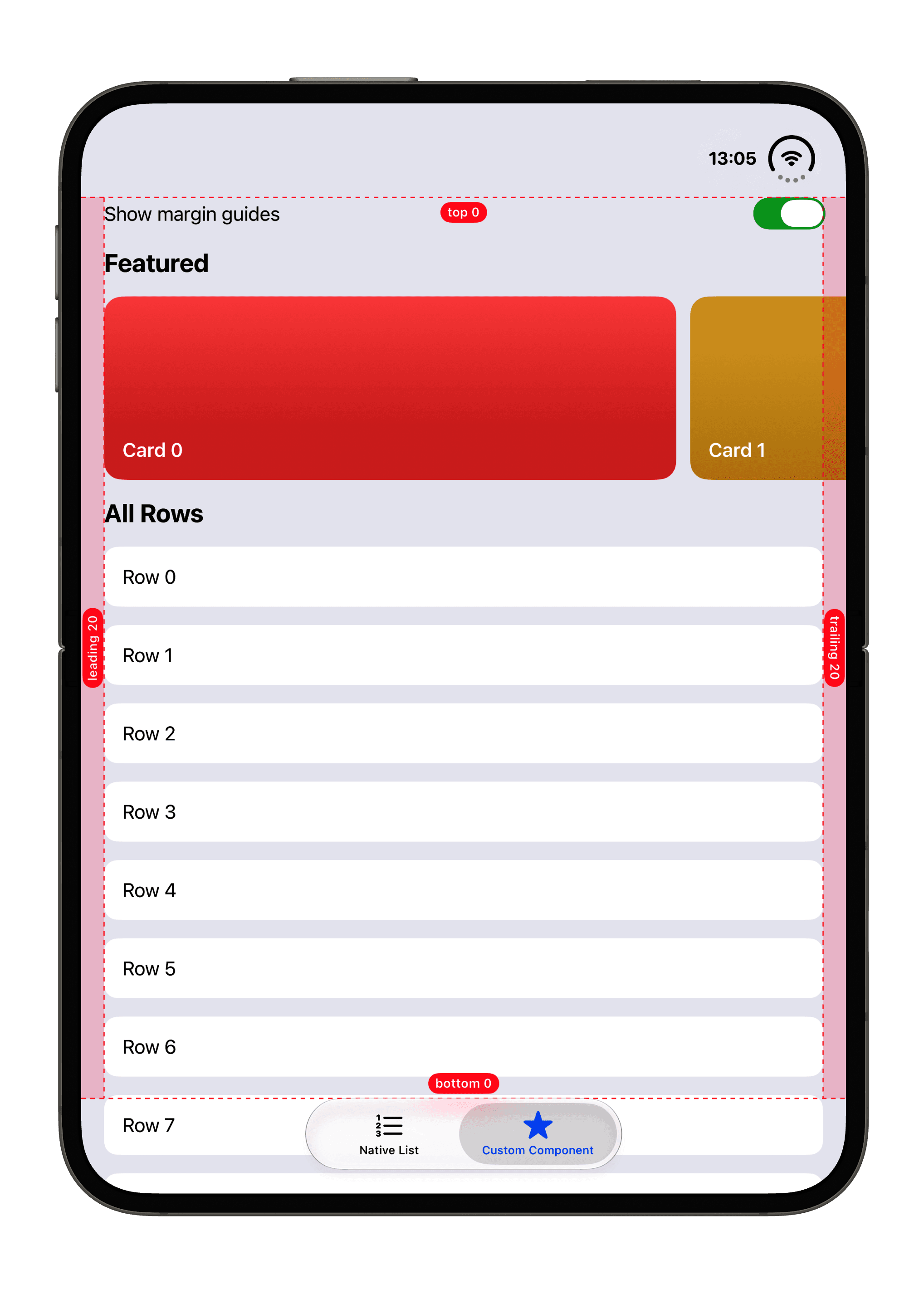
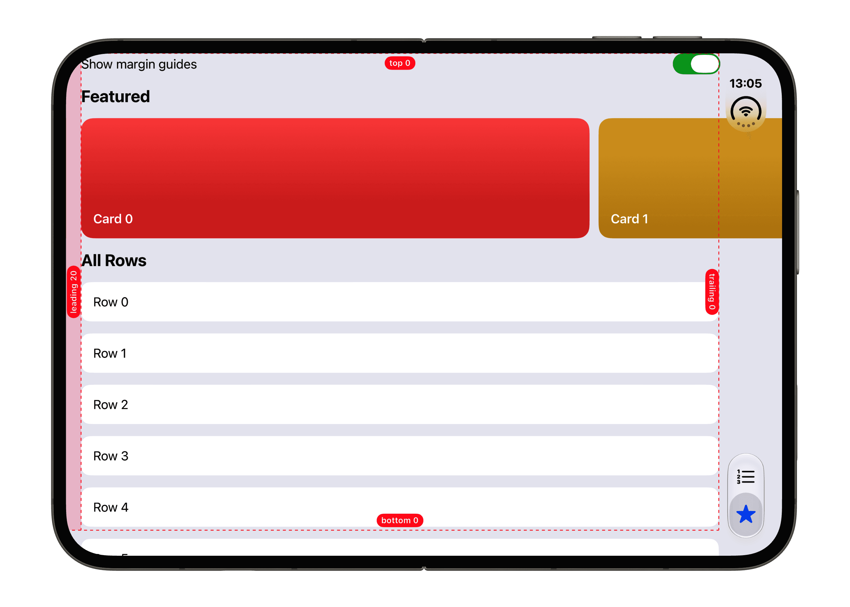
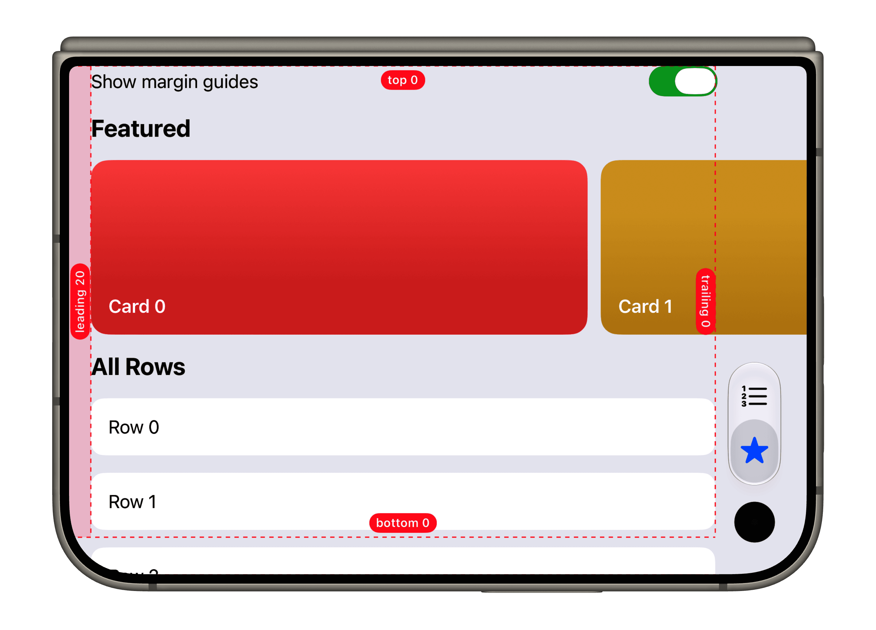
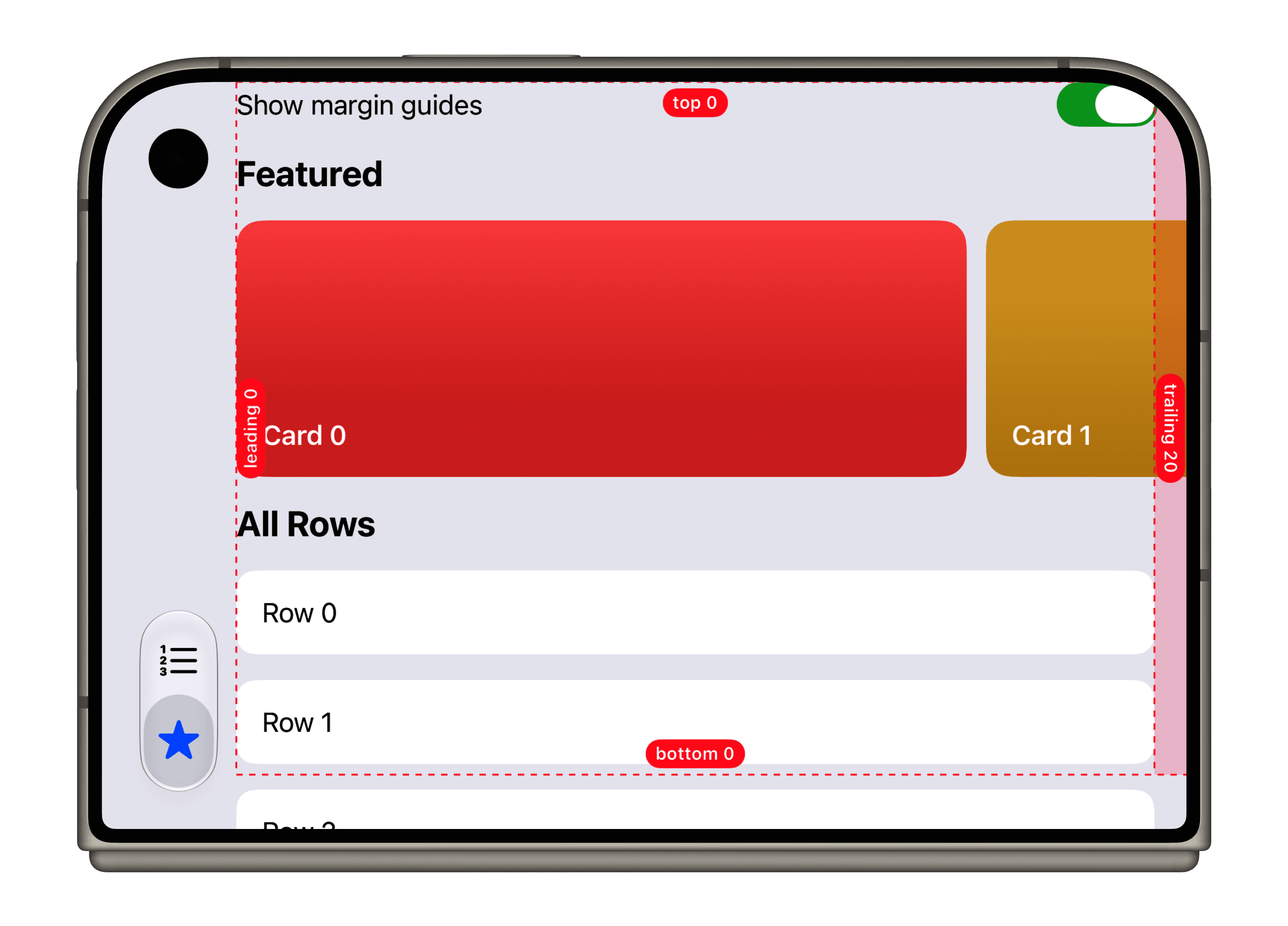
To see how the margins change, the screenshots below show a debug overlay that draws the content margins as dashed guides and labels the inset of each edge.
| State | Orientation | Leading | Trailing |
|---|---|---|---|
| Unfolded | Portrait | 20 pt | 20 pt |
| Unfolded | Landscape | 20 pt | 0 pt |
| Folded | Toolbar on the trailing side | 20 pt | 0 pt |
| Folded | Toolbar on the leading side | 0 pt | 20 pt |
The top and bottom margins are 0 pt in every case.
Unfolded
In portrait, the toolbar sits at the bottom as a regular tab bar, so both sides get the familiar 20 pt. Rotated to landscape, the toolbar moves to the trailing edge and the trailing margin drops to 0 pt.
Folded
When folded, the vertical toolbar is always present. The margin on the toolbar's side is 0 pt, and it switches sides when the device is rotated by 180°.
The New API
There are two new APIs, one on the View type and one on the GeometryProxy type.
@available(anyAppleOS 27.1, *)
extension View {
    nonisolated public func contentMargins(
        for guide: ContentMarginGuide,
        edges: Edge.Set = .all,
        alignment: Alignment? = nil
    ) -> some View
}@available(anyAppleOS 27.1, *)
extension GeometryProxy {
public func contentMargins(
for guide: ContentMarginGuide,
edges: Edge.Set = .all
) -> EdgeInsets
}Interestingly, these APIs are not part of the official SwiftUI documentation on developer.apple.com.
The View modifier applies the margins to a view, while the GeometryProxy method returns them as EdgeInsets so we can use the values ourselves. This becomes incredibly useful on iPhone Duo.
Both take a ContentMarginGuide. As of iOS 27.1, .container is the only guide available. The edges parameter limits which edges we care about. When reading the margins from the proxy, edges outside the set have a value of zero.
Applying the Margins
Applying the modifier to a custom view constrains it to the correct margins:
MyView()
    .contentMargins(for: .container)
If we need the values themselves, we can read them from a GeometryProxy and apply them however we like. For example, a header whose background spans the full width while its title lines up with the content margins:
GeometryReader { proxy in
    let margins = proxy.contentMargins(for: .container, edges: .horizontal)

    Text("Header")
        .frame(maxWidth: .infinity, alignment: .leading)
        .padding(margins)
        .background(.quaternary)
}
A Caveat with Scroll Views
There is one caveat, though. The modifier insets the view it is applied to, not its content. Most of our screens are based on a ScrollView, and if we apply the modifier directly to it, the whole ScrollView becomes inset. This looks off, most noticeably because the scroll indicator no longer sits at the trailing edge of the screen.
ScrollView {
    // Content
}
.contentMargins(for: .container)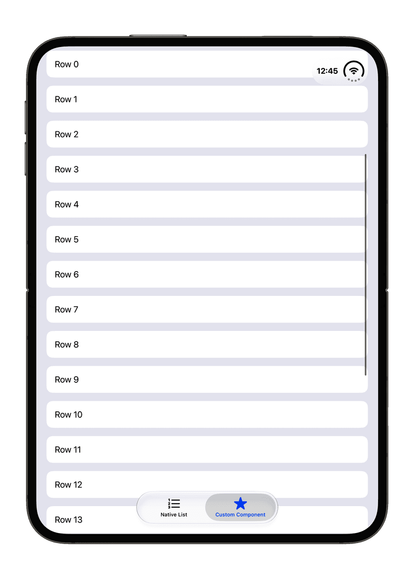
Unfortunately, there doesn't seem to be an API like this yet:
.contentMargins(.container, for: .scrollContent)However, we can use the new GeometryProxy method to build our own small API that looks like it could come from Apple.
@available(anyAppleOS 27.1, *)
extension View {
    func contentMargins(
        _ guide: ContentMarginGuide,
        _ edges: Edge.Set = .all,
        for placement: ContentMarginPlacement
    ) -> some View {
        modifier(ContainerContentMargins(guide: guide, edges: edges, placement: placement))
    }
}

@available(anyAppleOS 27.1, *)
private struct ContainerContentMargins: ViewModifier {
    let guide: ContentMarginGuide
    let edges: Edge.Set
    let placement: ContentMarginPlacement

    func body(content: Content) -> some View {
        GeometryReader { geometry in
            content.contentMargins(edges, geometry.contentMargins(for: guide), for: placement)
        }
    }
}
Now we can apply it just like a system API:
ScrollView {
    // Content
}
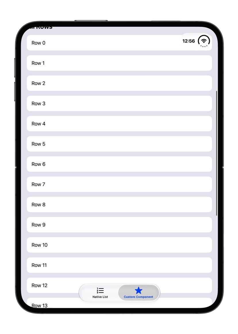
.contentMargins(.container, for: .scrollContent)
This gives us the correct behaviour. The rows line up with the content margins, while the scroll view and its scroll indicator still span the full width of the screen.
Please be aware that wrapping the content in a GeometryReader changes how the view is sized. GeometryReader takes up all the space it is offered, which can break your layout if you are not careful. I recommend applying this modifier primarily to scrollable containers, which is also where the system API falls short. For all other views, I haven't run into any issues with the system modifier.
Conclusion
With this small API addition we finally gain access to the system's content margins. This isn't only useful on iPhone Duo. On OS 27.1 and later, we can replace hard-coded 16 or 20 pt paddings with the new modifier, or with our small extension for scroll views, and stay aligned with the system automatically.
Please reach out to me if you find any mistakes, or have questions or suggestions. You can find ways to contact me on my About page.
See you next time! 👋